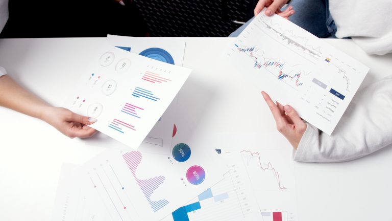
As a trader, it’s ideal and essential to know how to read charts because this will help you identify market movements. Traders use this to help them decide when to open and close a position since charts will show you price trends when scouting for opportunities.
It’s pretty essential when investing and there are around 5 common charts used in trade. So to know how to read any chart that comes your way, it’s best to know the most common platforms and the companies use.
To help you out, below is a list of common charts used to display your data and metrics:
1 – Bar chart
Probably the most common one of all is the classic bar chart. The length of the bars in a bar chart graphically represents the data values, with each bar representing a particular group or category that is being measured.
These graphs provide an easy-to-understand and intuitive means of comparing various data sets. Bar charts can be shown either horizontally or vertically, depending on the orientation. They are sometimes called column charts when they are stacked vertically.
Data is frequently presented using vertical bar charts, which make it simple to compare various categories. However, horizontal bar charts become a useful option when there are a lot of subcategories or when the labels connected to the bars require enough room for clarity.
2 – Line chart
Another common chart you can expect to bump into is the line chart. When it comes to displaying patterns and changes in data across constant measures, such as time intervals, line charts are an extremely useful tool.
Line charts show how values change over time or other continuous factors in an easy-to-understand manner by joining data points with lines. The line’s upward or downward movement draws attention to positive or negative changes, accordingly. This makes it simple for viewers to see trends and variations in the data.
With the aid of this trend visualisation tool, readers may make well-informed forecasts or projections regarding future events as well as get insights into the direction of change.
3 – Pie chart
Pie charts are a popular visual aid for data visualisation that works well for showing percentages or ratios throughout an entire dataset. Their method of operation consists of dividing a circular graph into sectors or slices.
Each slice corresponds to a subset of the entire dataset. Viewers may easily understand the relative importance of various categories or dataset components since each slice’s size corresponds to the fraction of the whole dataset that it represents.
Pie charts can provide an easy approach to highlighting the relative relevance or value of each category in the dataset. Viewers may quickly determine which groups command the biggest ratios of the total and which ones compose lesser amounts according to the pie chart’s visual portrayal.
4 – Scatter Plot
A scatter plot uses points on two axes, one for each variable, to show values on two numerical variables. Whether the connection between the displayed variables is weak or strong, positive or negative, linear or non-linear, scatter plots offer a flexible way to show it. Finding outlier points and any gaps in the data may also be effectively accomplished with scatter plots.
5 – Histogram
Histograms are effective tools for illustrating how numerical data is distributed throughout a dataset. Histograms are specially made for continuous data, as opposed to discrete bar charts, which show categorical data. This makes them ideal for showing the variation of data along a continuous scale.
Because both histograms and bar charts use bars to display data, their structures are similar. On the other hand, histograms are different in that they show the frequency or count of data that fall into pre-established “bins” or intervals throughout a continuous range. A histogram’s bars show how frequently data falls inside a certain interval, giving a clear picture of the distribution of the data over various value ranges.
Histograms provide information on the form, distribution, and central tendency of the data by breaking the data into periods or bins and charting the amount of data points within each bin.
Take away
Now you know 5 common charts used in trade, you can bet you’d never get confused when stumbling into these charts during your trading journey. Some trading platforms allow you to customize your account you can choose a chart to display your metrics and data, spending on your preference.
So if you ever ask yourself, how to trade shares, forex and whatever market you’re investing in, we’re sure knowing how to read charts is one step to efficiently trade in any market you get into.


0 Comments